hGSuite HyperBrowser: a web-based toolkit for hierarchical metadata-informed analysis of genomic tracks
Tabs
2. Examples - Case study describing the use of hGSuite. Here you can find detailed information about uploading the data, different statistical and visualization tool that can be used to on the genomic tracks.
3. Tool - This tab has the list of tools that are available and the hyperlinks.
4. About - Information about the hierarchical genomic HyperBrowser and the contact information.
Multi dimensional genomic data
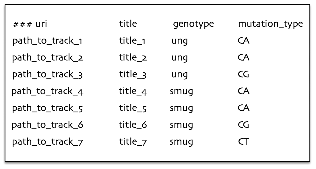
In the below example we illustrate the basic appearance of a hGSuite. Each row represents a genomic track as indicated by the ‘path_to_track’ entries. Each track also has metadata associated to it, in this example the metadata is the genotype and the mutation type. By representing data in this way we are able to perform analyses on single tracks as well as comparative analyses between or across tracks.
The data can be grouped based on the question of interest, enabling easier analysis. For example if we are interested in statistical analyses like average number of genomic elements per defined group, where the group is defined by the character genotype (look at the left figure) or it can also be a group defined in combination with genotype and mutation type (look at the right figure).
In the example below, we calculated the average number of genomic elements for each track and calculated the average based on the group, ung and smug respectively. For the groups defined by the combinations of genotype and mutation type, we calculated the number of genomic elements for track 1 and 2 separately and calculated the average based genotype and mutation types like ung-CA group, ung-CG, smug-CA, smug-CT. For the groups defined by the combinations of genotype and mutation type, we calculated a number of genomic elements for tracks 1-2 separately and averaged them out (ung-CA group), and we did the same for the other groups (ung-CG, smug-CA, smug-CG, smug-CT).
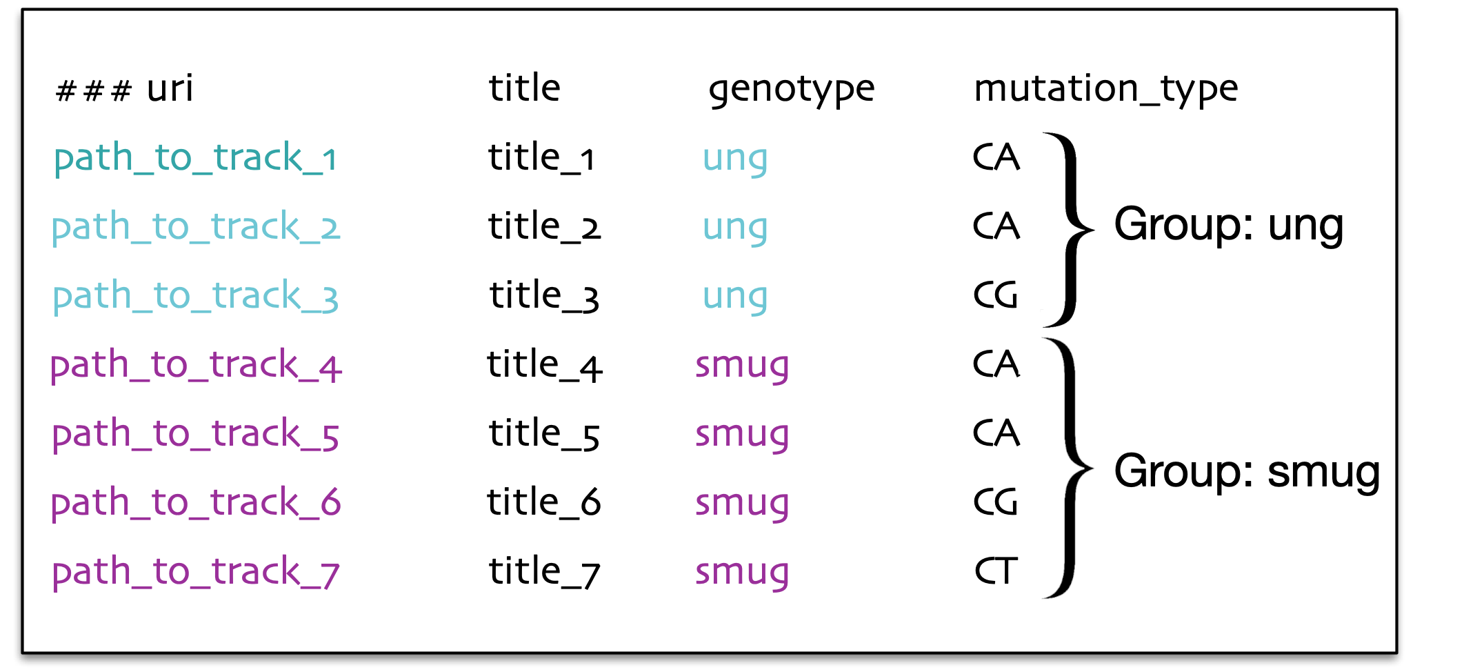
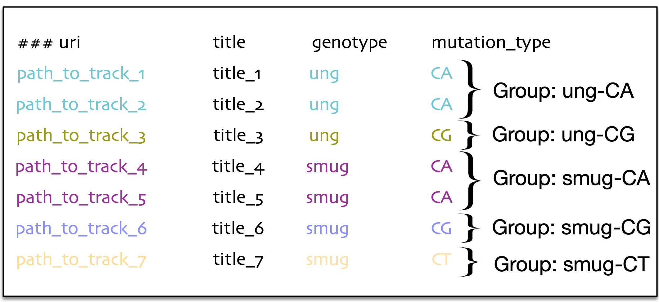
hGSuite can group the data in several different ways. Depending on the question of interest, the grouping method is likely to change. For example, the panel on the left side shows that grouping can be defined by the genotype of the tracks, while the panel on the right shows that grouping can be defined by a combination of genotype and the type of mutation.
From these various groupings we can calculate the number of genomic elements per track (which have been grouped) as well as calculate the base pair coverage within genotype or mutation type (or both). These are a few of the possibilities available when using hGSuite.
Why use hGSuite?
- Data - A user can upload their own data or download it from external repositories using the tools named 'Create a GSuite from an integrated catalog of genomic datasets' or 'Create a remote GSuite from a public repository' respectively. Data on a local computer can be organized into a hierarchical folder structure and uploaded to the web server as a tar or zip file with the tool named 'Create a GSuite from an archive (Zip/tar) in history'). A hGSuite can be created from an uploaded tar file using the same tool, where the folder structure of uploaded data will be reflected as metadata columns in the hGSuite. To rename metadata columns the 'Modify metadata in hGSuite' tool can be used. To add metadata we can use the 'Add a metadata column in hGSuite' tool.
- Data pre-processing - Within the web platform, collections of datasets are represented in the GSuite format, a simple tabular text format that includes metadata for each track in a given collection. The platform includes a tool for preprocessing the GSuite: 'Preprocess a GSuite for analysis'.
- Statistical analysis and visualization - Analyses are provided within a collection of genomic tracks (using the 'Compute data cube for hGSuite' tool) as well as a pairwise combination of genomic tracks (using the 'Compute data cube for relations between hGSuites' tool). Both tools are restricted by their metadata where hGSuites require that the metadata column titles match. If this is not the case, the 'Create or modify hierarchy of hGSuite' tool can be used to add or edit the metadata within a hGSuite.
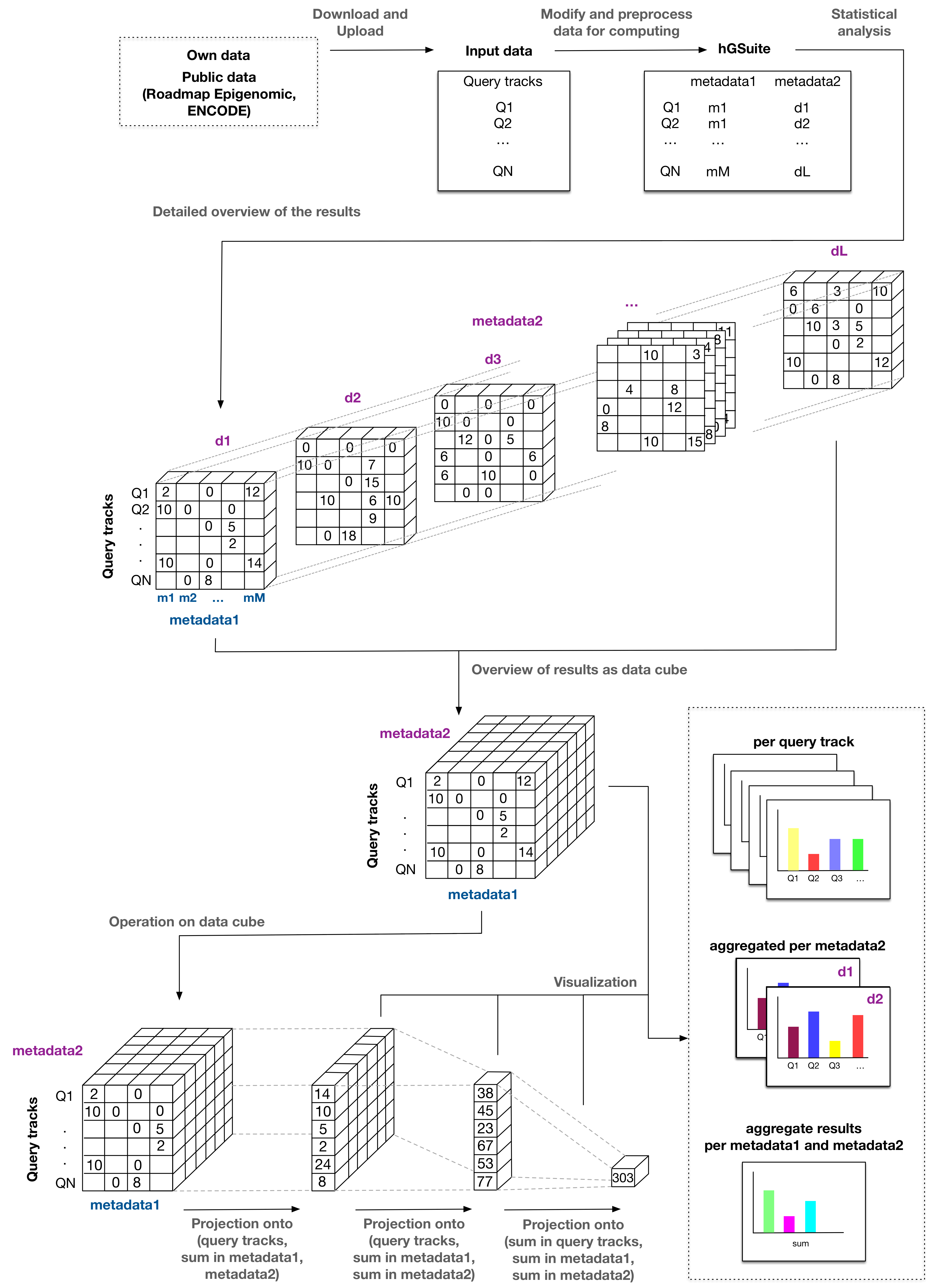
- Exploration of analysis results - The results of analyses for each genomic track are represented as a data cube (multidimensional array of values). A data cube is an arrangement of data suitable for analysis from different perspectives through operations like slicing, dicing, pivoting, and aggregation. The metadata of the genomic tracks is used based on user input to carry out the above operation(s) on the data cube. The results of that would be a two dimensional array, that would enable the user to draw overall conclusions in a time efficient manner. The tool 'Compute data cube for hGSuite' allows users to compute statistics for a single hGSuite (which may contain multiple tracks), while the 'Compute data cube for relations between hGSuites' tool is used to represent results as data cube between two hGSuites.
Introduction
hGSuite is a galaxy-esque tool which allows users to perform a large diversity of statistical analyses on datasets of various sizes. Every tool can be found or searched for on the left hand side while the history on the right hand side will contain the elements created by the tools used. After every tool use, the webpage will refresh in order to update the history. We ask that users keep this in mind as a refresh of the webpage can take a few seconds to execute. Therefore after every tool execution, please wait for the webpage to refresh before continuing.
If you require more information about specific tools, you can use the ‘Tools’ tab to browse the various tools available and get more information on these.
Example 1. Explore DNA repair enzymes and mutations (i.e knockout mouse data)
Our goal in this project is to explore the nature of DNA repair enzymes and mutations
in knockout mouse data. We received 22 genomic tracks from our collaborators,
these are called query tracks.
These 22 tracks are divided into four groups
a) Six tracks of UNG-/-;SMUG1-/-
b) Four tracks of SMUG1-/-
c) Five tracks of UNG-/-
d) Five tracks for Wild-Type(WT)
Step 1. Data preparation
Preparing the data: (Click here to view an example)
Data can be uploaded in a variety of ways. In the case of this example, we had vcf files which were converted into bed files (step done outside of HyperBrowser). We then uploaded these bed files to our freshly created history using the ‘Upload File’ tool. There are several methods to upload the data, in our case, we have all the bed files needed in one folder of the computer and we load them all together using the ‘Choose local file’ option from the aforementioned tool.
We then have to specify the type of files as well as the Genome. The Type can be specified for the first file and the rest will automatically become that type. The same for the Genome.
Note: There is a known bug about not being able to select the required genome. In this event, leave the genome as unspecified. This step can be rectified in step 3.
Note: If a genome was left unspecified in step 2, it can be specified during the creation of the GSuite. Here we select the mm10 genome build.
Here the metadata must be added manually for each file. Metadata can represent anything. Though using this tool, only one column can be added at a time, therefore it is important to ensure that for every column added, the same type of data is added to each file of the GSuite.
In our example, we add the genotype of the mouse, since this example explores the different mutations found in various mouse knock-outs.
In this example, we have five genotypes, with a different number of files per genotype:
Wild-Type (WT) → 5 samples
UNG -/- (ung) → 5 samples
SMUG1 -/- (smug1) → 4 samples
UNG -/- ; SMUG1 -/- (ung-smug1) → 6 samples
A hGSuite allows for hierarchical clustering of the GSuite. In essence, it’s a GSuite but with more options to perform cross-metadata statistics. Since this examples takes us from bed files to the analysis of mutation data, it is important to do so with the hierarchical version as we will want to compare statistics between genotypes and mutation types. Comparison across more than two metadatas are possible if necessary.
Note: This tool can take in both a preprocessed or primary GSuite, however it will output a hGSuite of the same type. Since we will still be performing additional modifications to the file, we submit a primary version.
When we submit a file to this tool, we are asked to define a level of hierarchy. These are the ‘levels’ that will be available to use within cross-metadata statistics. Therefore we select ‘genotype’ as our first level. Additional levels will be added later in the example.
This tool essentially extracts information for the column called ‘title’ in your tracks. This column represents the mutation types found in your bed file. Our use of this tool is to extract all mutation types found and store them as metadata as we will want to compare these results with the genotypes we have.
To run this too, we submit our freshly created hGSuite, select the ‘filter by word’ option and input the following ‘words’:
AT,AC,AG,TA,TC,TG,CA,CT,CG,GA,GT,GC
It is important that each separate ‘word’ (or mutation in this case) be separated by a comma. The line in this example represents all possible mutations, so simply copy and pasting it is optimal.
We then ensure that words are added separately (by selecting ‘yes’ in the appropriate drop-down menu)
In part 6 we extracted all the mutation types, however it is important to note that certain mutation types essentially represent the same mutation. For example, AT to TA is exactly the same mutation when looked at from a DNA perspective. Therefore for this example, we concatenate this pair (and other pairs of the same nature).
We start by inputting our hGSuite which has the mutations and is primary. We then select the metadata requiring concatenation, in our example, that is the ‘attribute’ column. Afterwards, we write the following concatenations, each in a separate window.
Note that a new window appears every time one is filled in.
The concatenations used are the following:
AT,TA
AC,TG
AG,TC
CA,GT
CT,GA
CG,GC
The last step is to indicate which column should be treated as unique. This option means that the selected column(s) will not be concatenated, in our case this is the genotype column. To further explain, if we were to not select the genotype column, HyperBrowser would concatenate all the AT,TA found across all genotypes, this would result in the inability to distinguish results between genotypes since they would all be merged together. Therefore, by treating the genotype column as ‘unique’ we ensure that concatenation of mutations is only done within each genotype and not across all genotypes.
Preprocessing the data creates three elements in the history. One is the preprocessed GSuite, the other is the bed files that could not be preprocessed (if any) and the third is a progress bar. In our example, the progress bar is somewhat meaningless as it will occur quickly, but in larger analyses the progress bar is a neat element which allows you to better plan your day around elements which are currently in progress but not completed yet.
NOTE: Preprocessing is a step that must be taken to analyze GSuite (or hGSuite) files. However, in order to modify files, for example add metadata, you must do so on a non-preprocessed version of the file (which we call ‘primary’).
The reason this exists is because preprocessing is a mathematical preparation for analysis, though this preparation can alter based on the format of the file (i.e number of metadata columns). Therefore, modifications must occur on primary files while analysis must be made using a preprocessed file.
TIP: Due to the sometimes confusing nature of preprocessed and primary files, we recommend to re-name the elements in the history to a naming convention that makes sense to the user. In this example, we use the file type (GSuite/hGSuite) followed by a defining feature (i.e w/ metadata) and then it’s format (primary or preprocessed). All together, this would look like the following: GSuite w/ metadata primary.
By default, a tool will output a file in the history which has the name of the tool itself. We therefore recommend renaming each file as they are created. In addition, HyperBrowser allows users to add descriptions to each file. This can be used to further organize and detail the various steps taken in the analysis.
Step 2. Analysis
Observe the distribution in mutations across genotypes
Using the Compute data cube for hGSuite tool
we will start by inputting the preprocessed hGSuite created in the previous step, and
ensure that the correct genome assembly is selected.
We can then select one of four statistics, here we choose the ‘Coverage (Counts of elements)’.
We then need to select across which columns the statistic will be calculated, here
we select both the genotype and the attribute respectively. We then leave the remainder
of parameters as their default setting.
Click here to view an example, el. 2
Once the data cube is completed, we can view it using the ‘eye’ button.
Here we have several options. For the purpose of this example,
where we seek to observe the differences in mutation type and quantity across
genotype, we do the following: Set the ‘How to treat raw’ option as
‘Aggregate across this dimension’ using the ‘average’ method.
We now have a table and associated bar plot showing us the coverage of each
mutation type within each genotype.
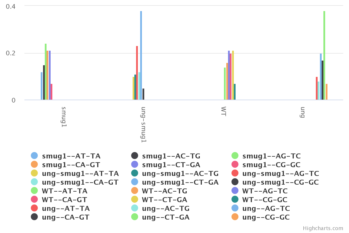
From here we can start doing some basic result interpretation.
The first observation that can be made is that there is little to no difference
between the WT and the SMUG1 KO. We can also see that the UNG KO seems to generate
the largest amount of mutations, and the CT-GA mutation is by far the dominant one.
Finally, we notice that the UNG-SMUG1 KO has fewer mutations than the UNG KO
alone.
From a biological perspective, we know that UNG is a
DNA glycosylase which is responsible for the repairing of these mutations. It is
therefore expected to see a large amount of C to T mutations when UNG is not present.
It also appears that SMUG1 serves as a compensatory element in the absence of UNG, however it
is error-prone and therefore generates further mutations.
Create multi rainfall plots
The rainfall plot illustrates the genomic position (x axis) versus the genomic distance
(y axis) where the genomic position represents the position along the genome,
starting from the beginning of chromosome 1 (left hand side) to the end of chromosome y
(right hand side).
The genomic distance is the distance between two points, with each point being a
point mutation.
In practice, the rainfall plot allows for the visualization of the distribution
and density of the mutations found within the data.
The ‘single’ parameter overlaps every track within the GSuite/hGSuite. As soon as
more than 3-4 tracks are within the dataset, this plotting method has a tendency of
being quite overwhelming.
The ‘multi’ method instead shows each track in it’s own area of the plot.
Where each track has its own segment on the x axis. The multi method is intended to
be used as exploratory while the single method is intended to be used as in detail
analysis of a few tracks at a time. In order to better illustrate this, we go
through the following example.
Note that the submitted GSuite or hGSuite must be in primary format.
We use the Generate rainfall plot tool
to first generate a 'multi' rainfall plot
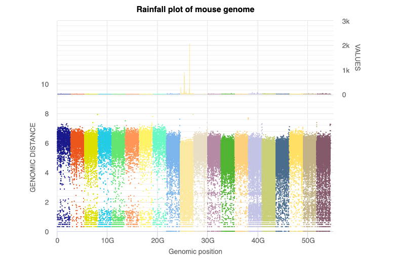
In this rainfall we see that the six groups to the left seem to be of larger interest
than the remainder of the data. Within HyperBrowser and the full image the legend is
made available, though it was too large to include in this figure. The six groups of
interest from left to right are the following:
UNG AT-TA
UNG AC-TG
UNG AG-TC
UNG CA-GT
UNG CT-GA
UNG CG-GC
We therefore seek to create a ‘single’ rainfall plot for these six groups.
In order to do so, we must first create a GSuite containing only these six groups,
which in effect are all groups of the UNG knock-out.
Filter data and create single rainfall plots
We use the filter hGSuite according to metadata tool
to split our hGSuite per genotype.
We start by submitting our primary hGSuite to this tool, select the division to be ‘by column’
and the selected column to be ‘genotype’ and execute the tool. This creates 5 separate hGSuite subsets,
each specific to one genotype of our initial hGSuite.
We then use the hGSuite subset for the UNG genotype in the rainfall plot tool, this time selecting 'single' as the plot type
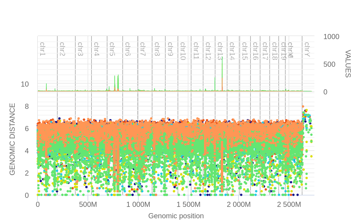
We see a large dominance of CT-GA mutations (green), of which these are found in
high density within the 13th chromosome as well as two different locations within
the 5th chromosome.
The rainfall plot within the HyperBrowser allows us to drag the cursor across the
screen to select a zoom area. Below we show these zoomed areas respectively.
We then did another filter, this time extracting all CT-GA mutations from the tracks for all genotypes. We then submit this to another 'single' rainfall plot. We observed that the UNG KO was the only contributor to the CT-GA mutations found in peaks of interest in chromosomes 5 and 13.
Explore genomic locations
Considering that we have now identified chromosomal locations of interest, we seek
to know if there is any overlap between these significant regions and certain genomic
regions such as exons or CpGs.
Note that the method illustrated below can be used as is (exons and CpG islands),
or it can be adapted to include many other regions such as introns, promoters,
or even specific genes.
1) Download tracks from UCSC
Here we download tracks from UCSC for exon regions and CpG island regions.
However, if one were to want to make their own track, the format is quite simple.
It must be a bed file containing three columns in the following order:
chromosome name (i.g. chr1)
start region (i.g. 36511763)
end region (i.g. 36513006)
These bed files are then uploaded to hGSuite using the ‘upload file’ tool.
2) Convert tracks to a GSuite
Here we simply create a GSuite using the Create a GSuite from datasets in your history tool.
3) Preprocess the gSuite
Done using the Convert GSuite tracks from primary to preprocessed tool .
4) Compute the data cube
We once again use the data cube, but this time the tool is named Compute data cube
for relations between hGSuites. This version of the data cube allows us to
compare two GSuites. We enter our original hGSuite (the one with the KOs and mutations)
in the first slot and our freshly created genomic location GSuite in the second slot.
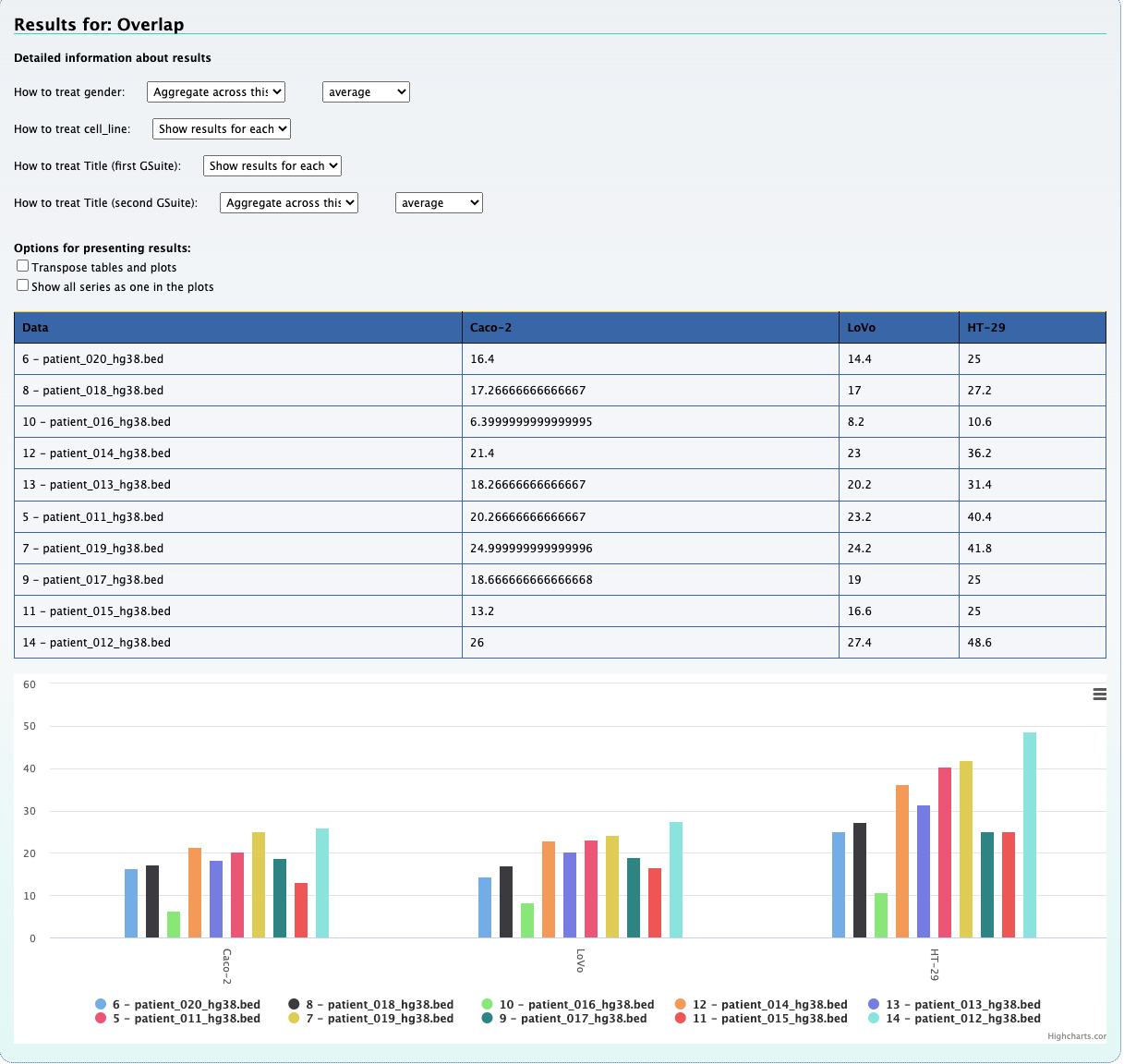
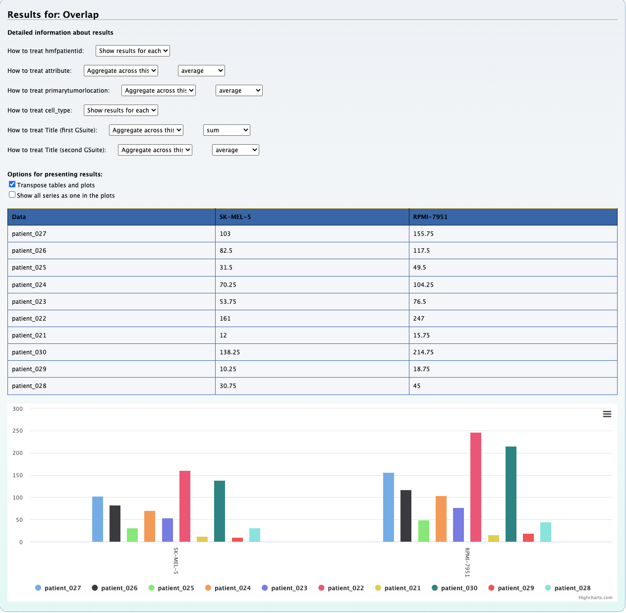
We select the statistic method to be overlap.
It is important to leave everything to its default setting, as specifying columns
will check for similar column name in both GSuites. In our case, we will simply be
comparing tracks, hence the un-specification of the column names.
Viewing these results shows us a table and a bar plot quantifying each KO+mutation
and the number of mutations which overlap with exons and CpG islands respectively.
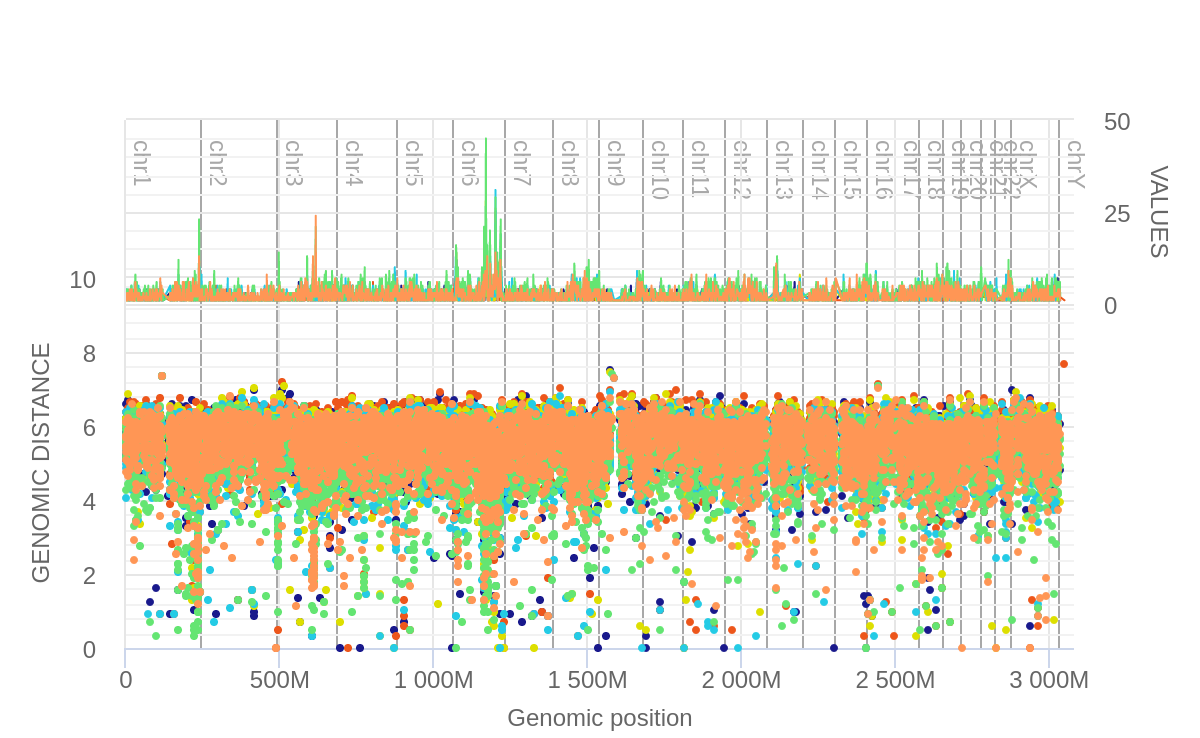
5) Chromosomal frequency view
Using the plot frequency of mutation along chromosome tool, we can generate
frequency plots for each individual chromosome. We can do so with a single GSuite,
or use two GSuites.
The first track inputted will be shown in the bottom of the plot while the second
track will be illustrated at the top. In order to input both GSuites we must select
‘Show results on one plot’ as the way of plotting. To reproduce the below image,
‘count point’ must be selected as the statistic.
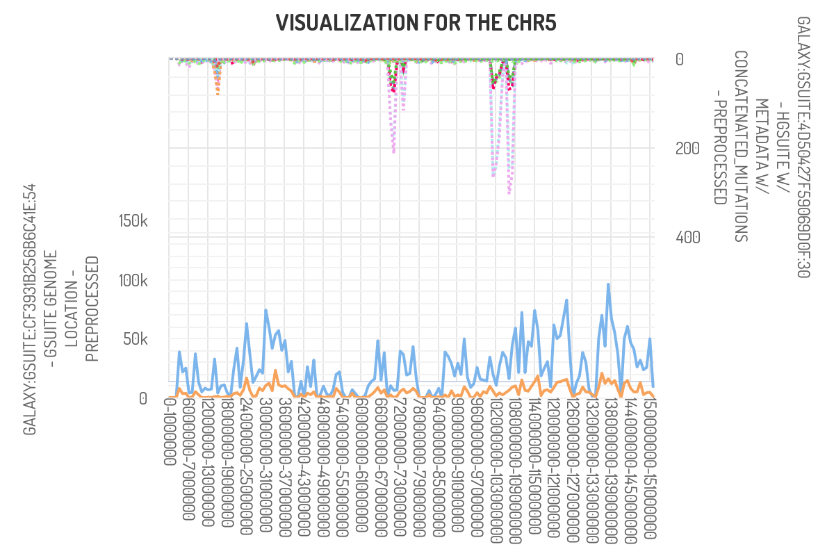
Have chromo freq above
Here we observe that our peaks of interest in chromosome 5 primarily coincide
with exon (blue line) and not CpG islands (orange). This was the expected
outcome as we utilized whole-exome sequencing for this dataset.
Example 2. Explore mutations in individual patients within three distinct cancer types
Our goal in this project is to explore the nature of DNA repair enzymes and mutations
in human cancer data. We received 30 genomic tracks from the Hartwig database,
these are called query tracks.
These 30 tracks are divided into three even groups of skin cancer, colorectal cancer,
and breast cancer. We have set of few basic exploratory question about the data that we can ask
Step 1. Data preparation
The data preparation steps are very similar in both examples. One point of divergence between the two examples is how the metadata is added.
Preparing the data: (Click here to view an example)
For this dataset we add the metadata using a tabular file downloaded from the Hartwig database. To do so, we select yes for the ‘add data from file’ slot. We then select our metadata file (that has already been uploaded to HyperBrowser).
Note that the file must have a sampleID column where the names match the titles in the GSuite it will be added to.
Step 2. Exploratory analysis - Here we will illustrate the cube by answering few common questions that can be explored with a dataset like the above.
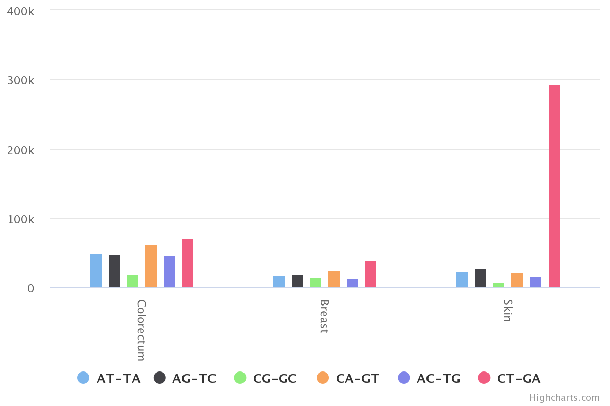
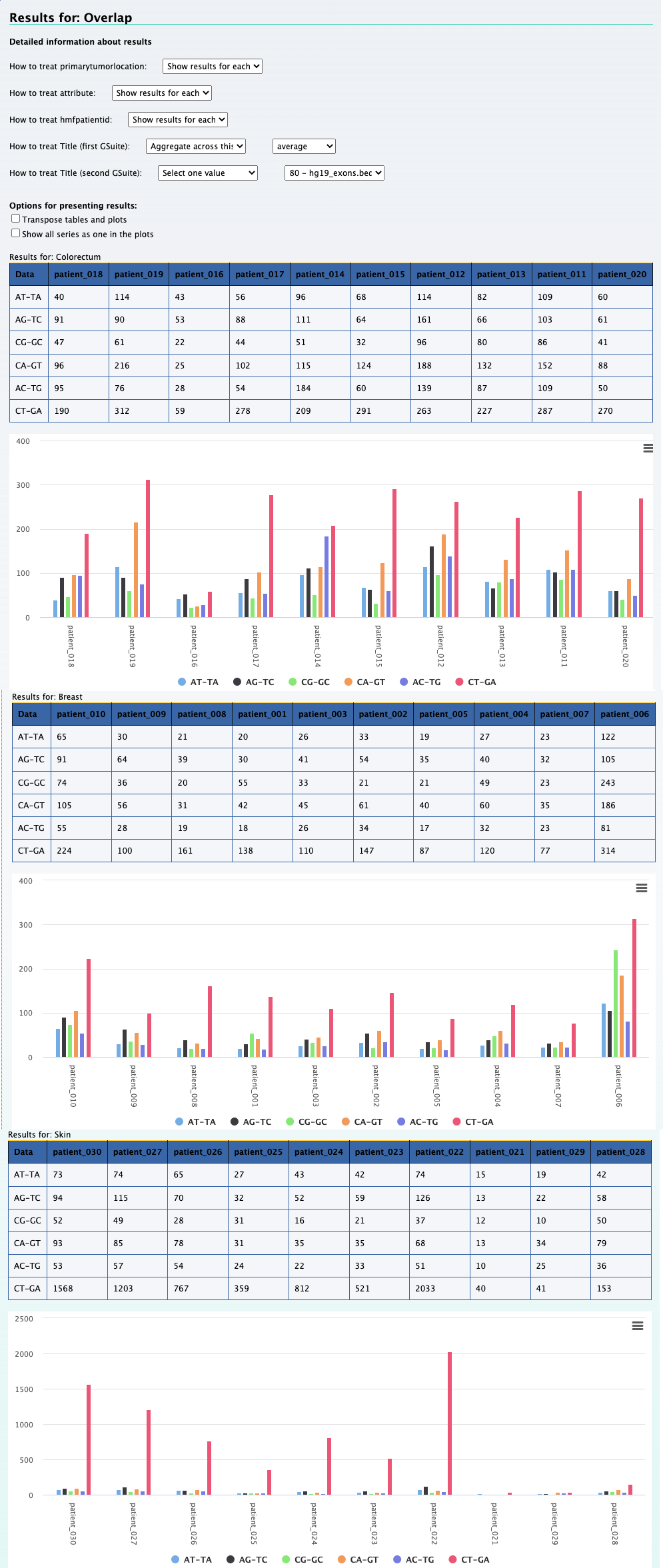
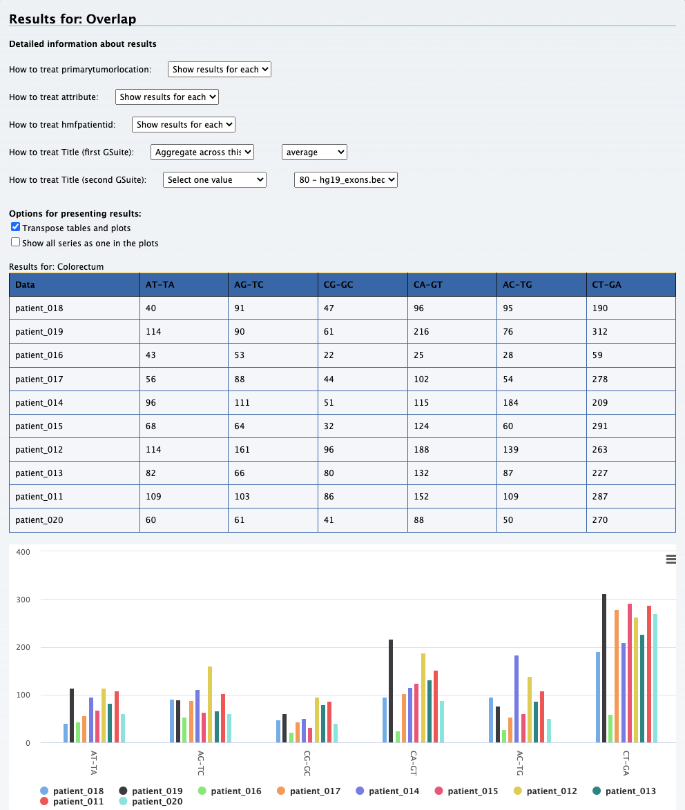
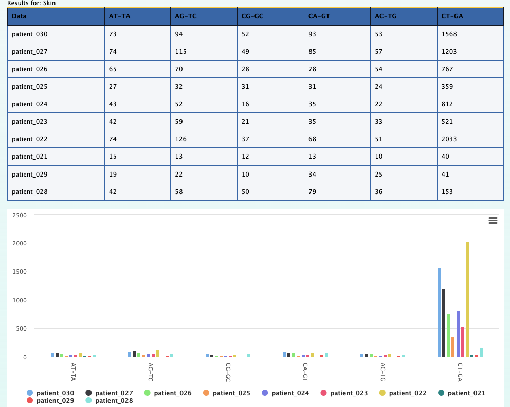
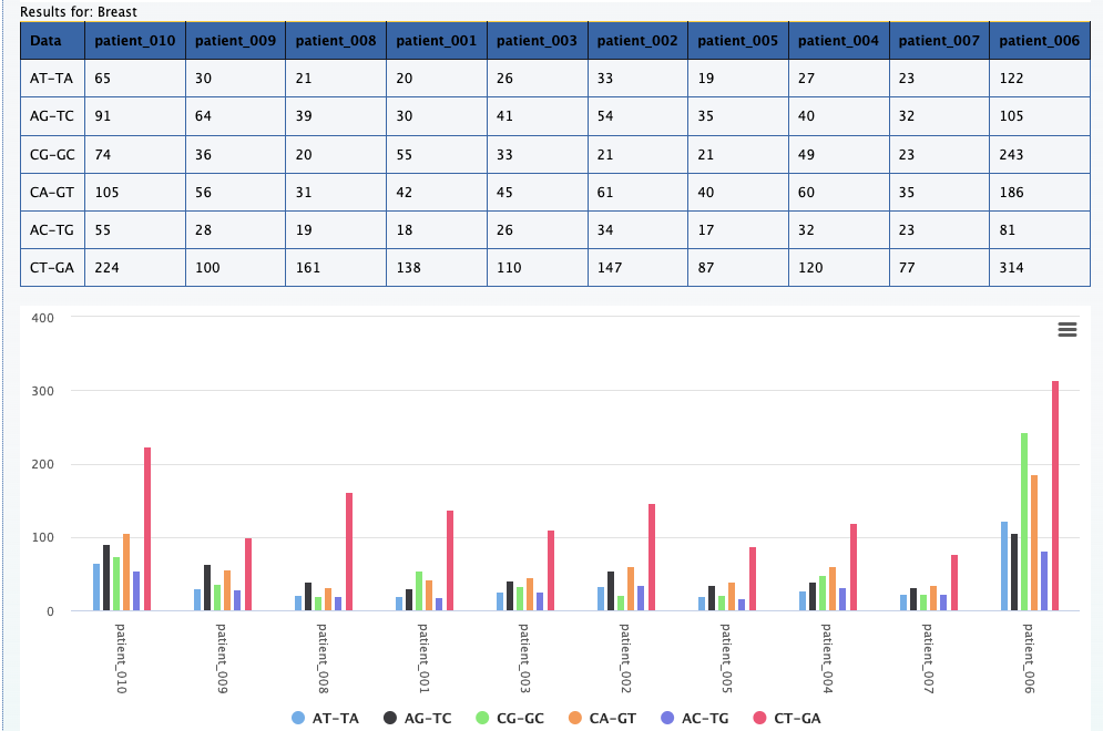
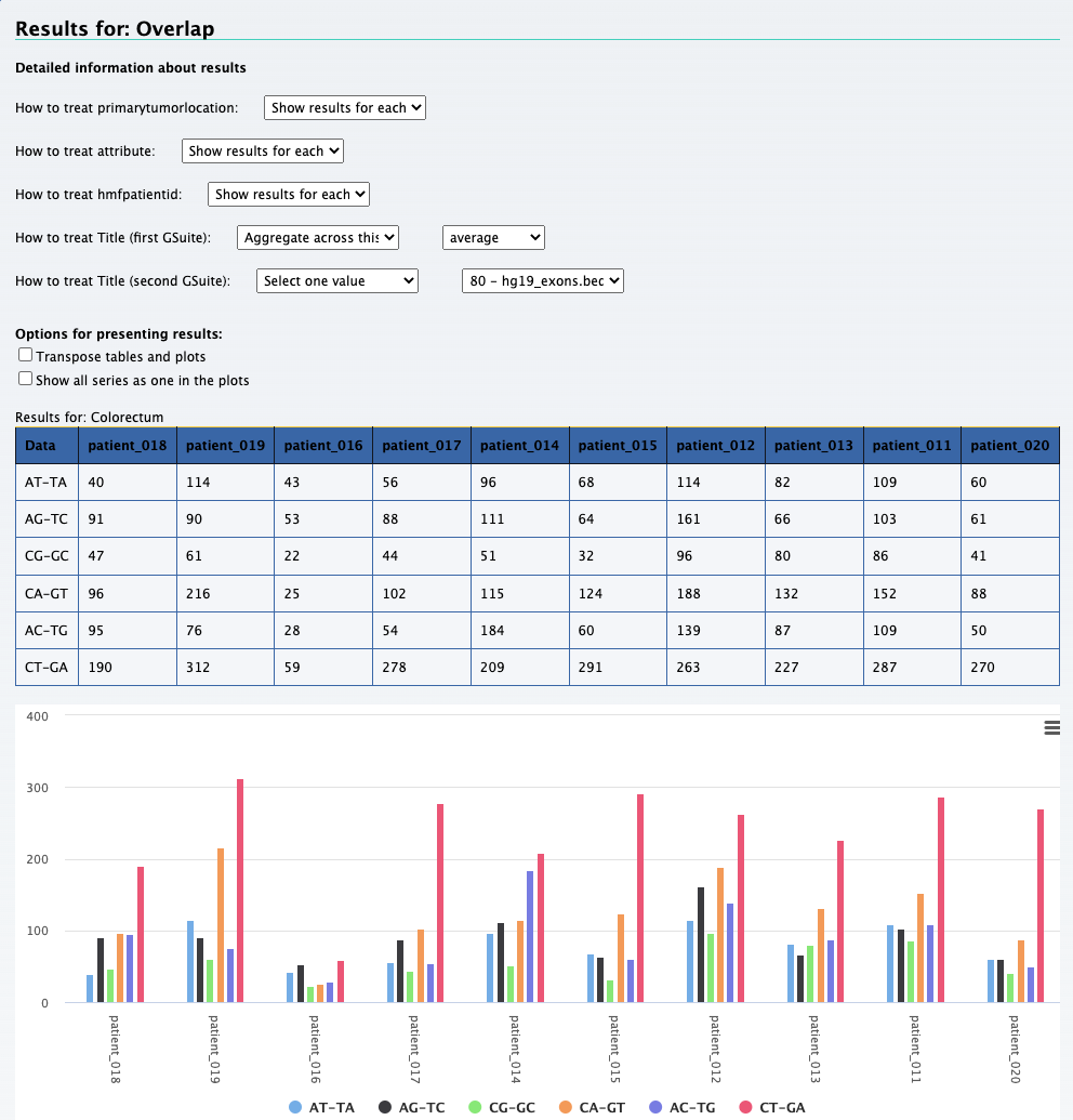
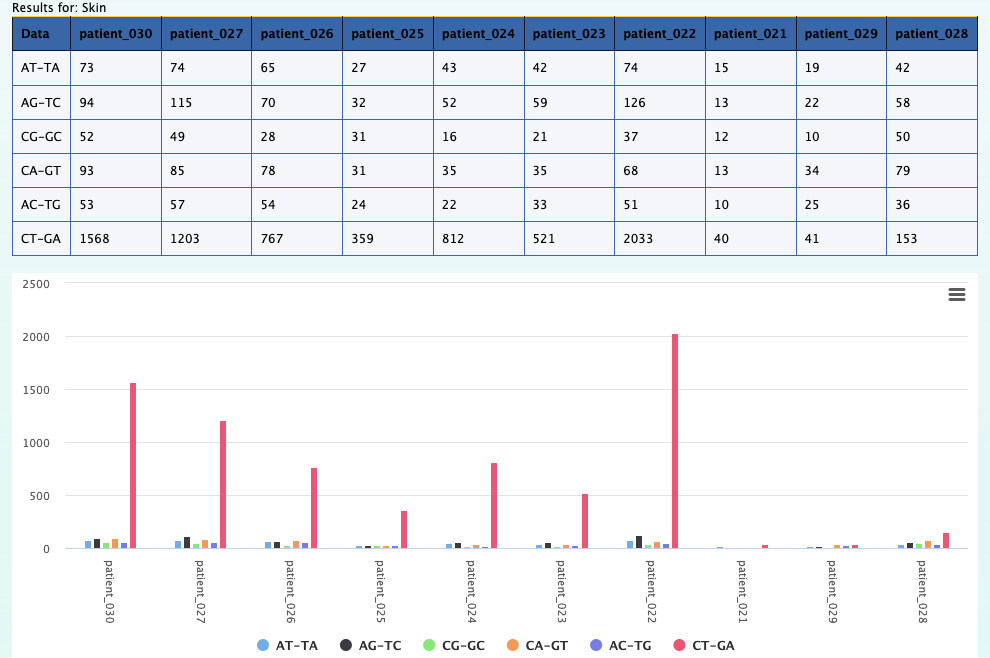
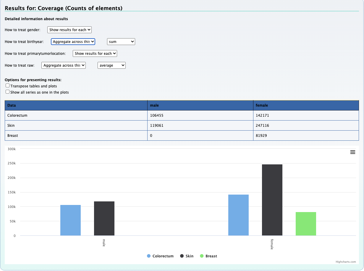
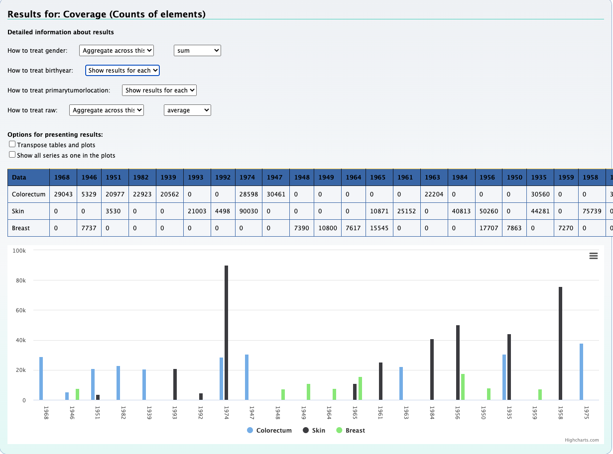
1. What is the observed distribution in mutations across patients and cancer types ?
Using the Compute data cube for hGSuite tool example we input our hGSuite and select the ‘Coverage (counts of elements)’ statistic. We then specify the three columns of interest, these are 'patientid','attribute', and 'primarytumorlocation'.
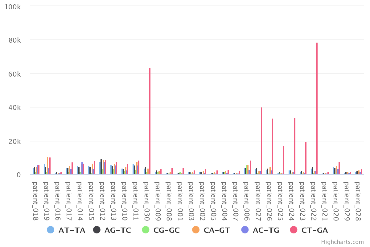
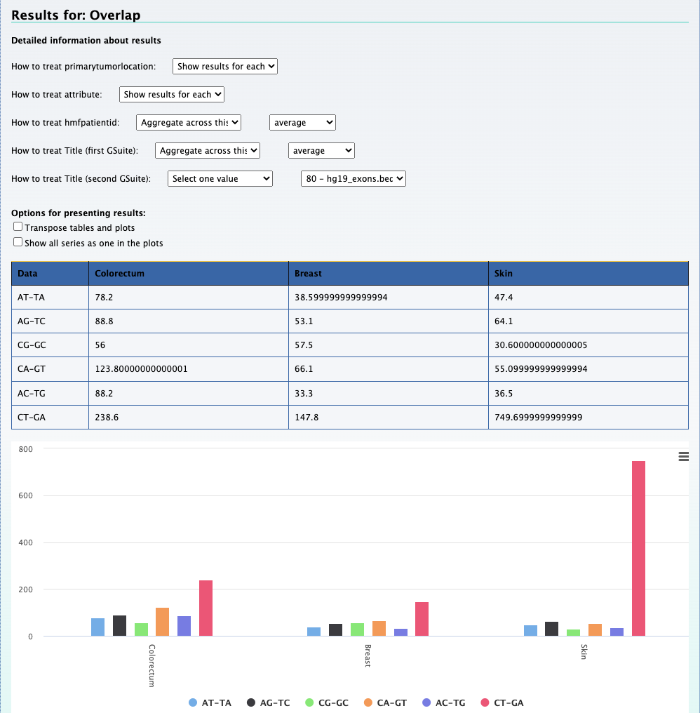
By aggregating 'raw' we can observe the mutation distribution per patient, that is shown in the plot above. We can also
aggregate across hmfpatientid to obtain the mutation distribution across cancer types.
The above data can also be plotted using multi rainfall plots
Due to the large amount of information, we first filter/divide our hGSuite (primary format) by cancer type
in order to not overwhelm the rainfall plots. This is done using the
filter hGSuite according to metadata tool
and selecting the 'primarytumorlocation' as the filter column.
We then submit all three hGSuites to the Generate Rainfall plot tool and use multi as the plotting
option.
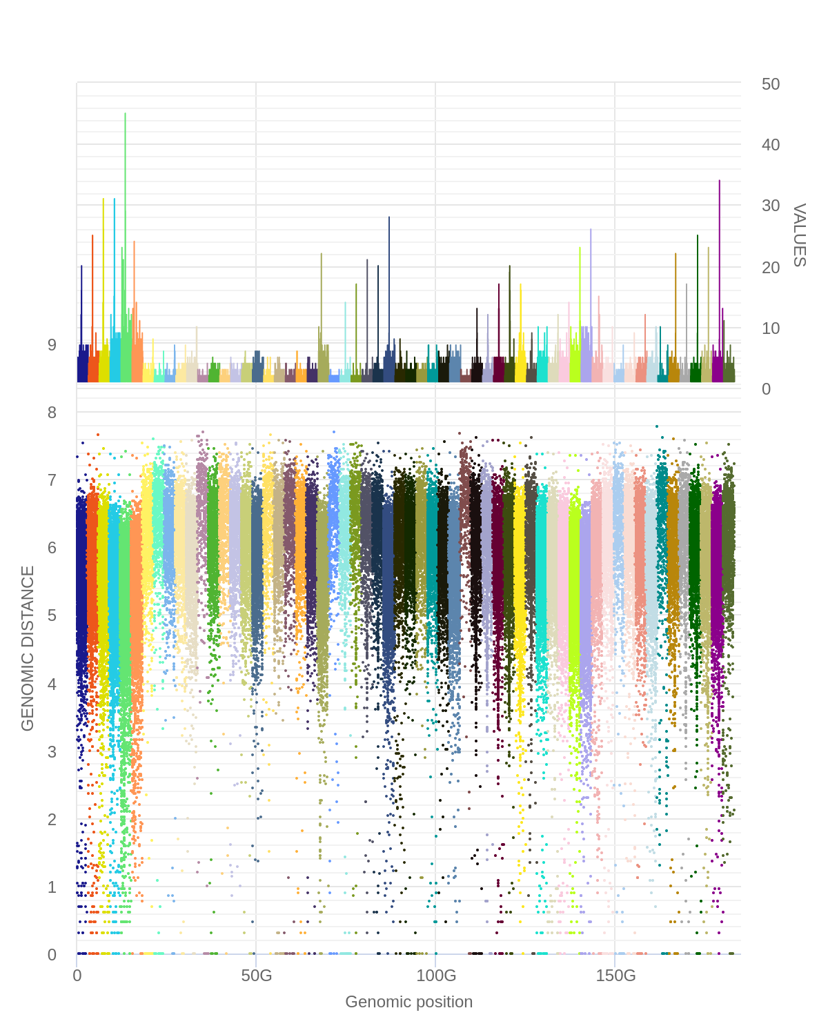
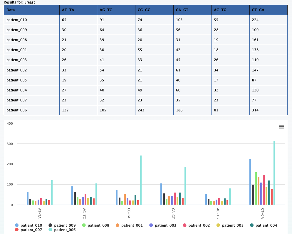
Here each color represents a specific mutation type in a specific breast cancer patient.
For example, the tallest peak (blue-ish in line with the 50G on the x axis) represents patient_006
and only the C>T;G>A mutations for that patient.
Using this type of plot we are able to look for possible abnormal mutation loads
in patients. The applications of such a tool are great. For the purpose of the
example, let’s focus our attention on that patient for now.
Extract individual patient data and plot using rainfall plots
We use the filter hGSuite according to metadata tool
and select 'hmfpatientid' as the column.
We then input the patient of interest (patient_006) to the rainfall plot and select
the 'single' parameter.
What we can notice here is that there is a very large area of chromosome 6 that
appears to be mutated. We also know that this is preferentially the CT-GA mutation.
An interesting question to ask would be if these mutations map to specific DNA repair
pathways.
2. What is the distribution of mutations across different genomic regions and how does it vary based other factors such as tumor type, gender and etc ?
2a. Do the mutations occur more often in coding regions or non-coding regions of the genome?
We upload bed files with genomic positions for coding and non-coding regions for the hg19. The uploaded bed files were converted to GSuite using the tool
Create or modify hierarchy of hGSuite tool hGSuite.
Further this data is preprocessed using the tool Preprocess a GSuite for analysis toolpreprocessed GSuite
To get the results and the plot we upload both the hGSuites, one for the coding and non-coding regions and the other containing the patient data along with the metadata that was preprocessed in the above step
(for reference check out element 39 and 84).
Compute data cube for relations between hGSuites tool Relational data cube
This cube element gives you a general overview of introns vs exons in the data. But we can several question with this cube using the pivot functionality.
Below is a set of questions and their answers that can be obtained using one cube. To do this we use the tool Compute data cube for relations between hGSuites toolRelational data cube
After we upload the cube we can set the hierarchy based on the metadata. The figure below shows the selections that has to be made in order to explore the data in different dimensions
SCREENSHOT OF THE SELECTIONS OF ELEMENT 98
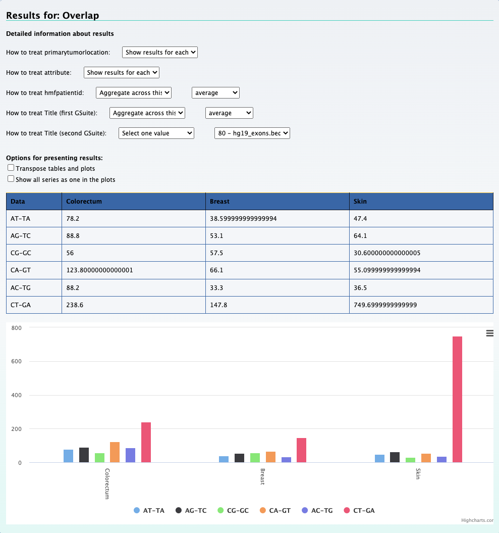
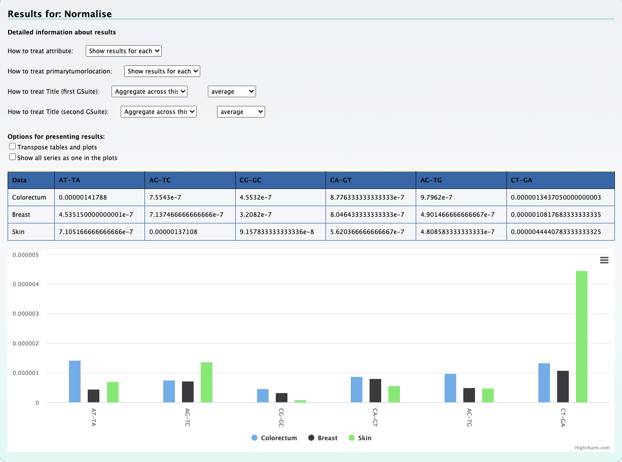
1. Which mutation type across different cancer types occur most frequently in the coding regions?
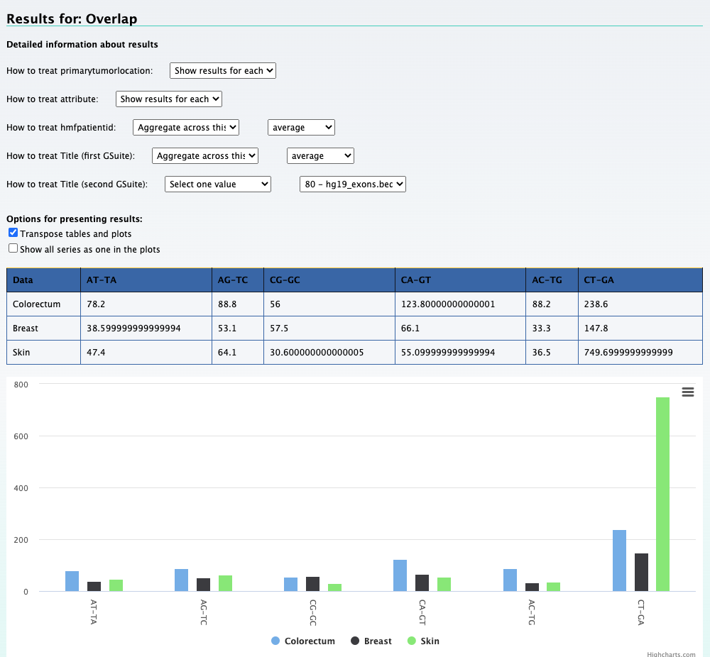
We can still use the previous element Relational data cube and transpose the table and plot to get the results for this question. The screenshot below on the left shows the
results along with selections that was made to get the results. On the right is the transposed plot that appears when you click on the transpose option.
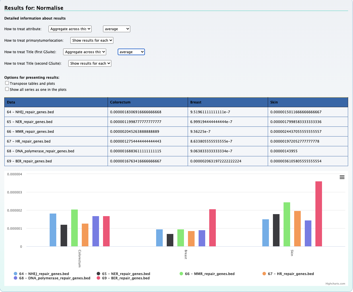
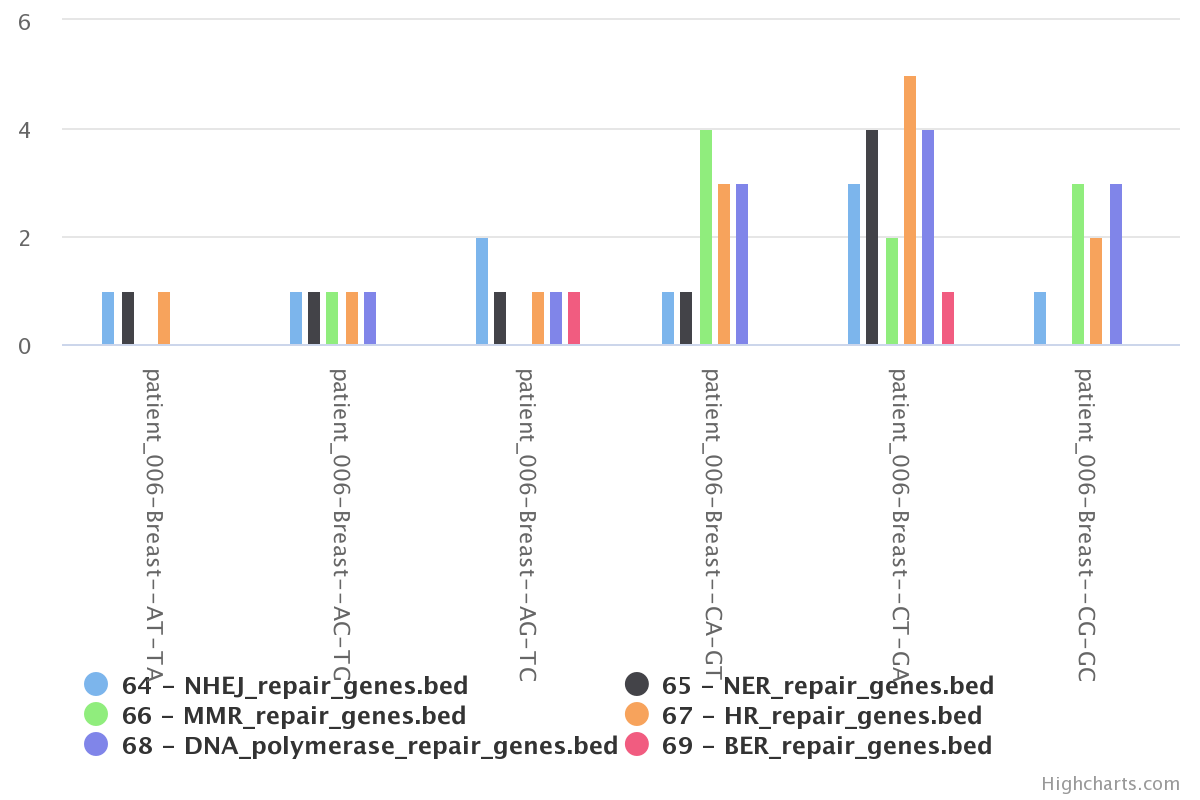
In this section we check for the overlap between mutations of a single patient with genes of DNA repair pathways. To do so, we created bed files representing six DNA repair pathways. This information was extracted from a gtf file for the hg19 genome.
1) Upload bed files
2) Convert tracks to a GSuite
We create a GSuite using the Create a GSuite from datasets in your history tool.
3) Preprocess the gSuite
Done using the Convert GSuite tracks from primary to preprocessed tool .
4) Compute the data cube
We once again use the data cube, but this time the tool is named Compute data cube for relations between hGSuites.
5) Chromosomal frequency view
Using the ‘plot frequency of mutation along chromosome’tool, we can generate
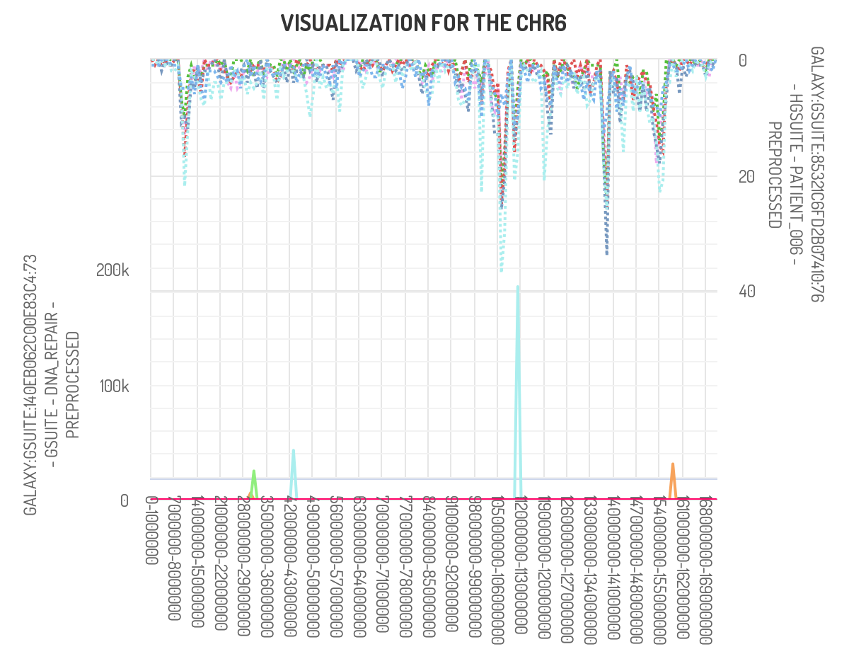
The above picture shows that the peak of interest in chromosome 6 does partially overlap with genes found in the DNA polymerase repair pathway.